Peachfork Winery
Fictional brand redesign campaign for a real location in Grand Junction, Co.
This brand redesign was created for a fictional trade show event. The redesign all started with the logo itself. The original logo was a tattoo-style design with a fork poking through a peach. It had a banner-style tattoo design where “peachfork” was inscribed. The tattoo style design did not fit with the overall brand of Peachfork since the rest of the brand was more farmstyle and family-oriented. What this rebrand aimed to achieve was make the logo and company cater more toward their homegrown and family-oriented roots. Starting with the logo a branch from their peach orchard was used to create the icon and the lettering for Peachfork was hand-designed to imitate tree branches.
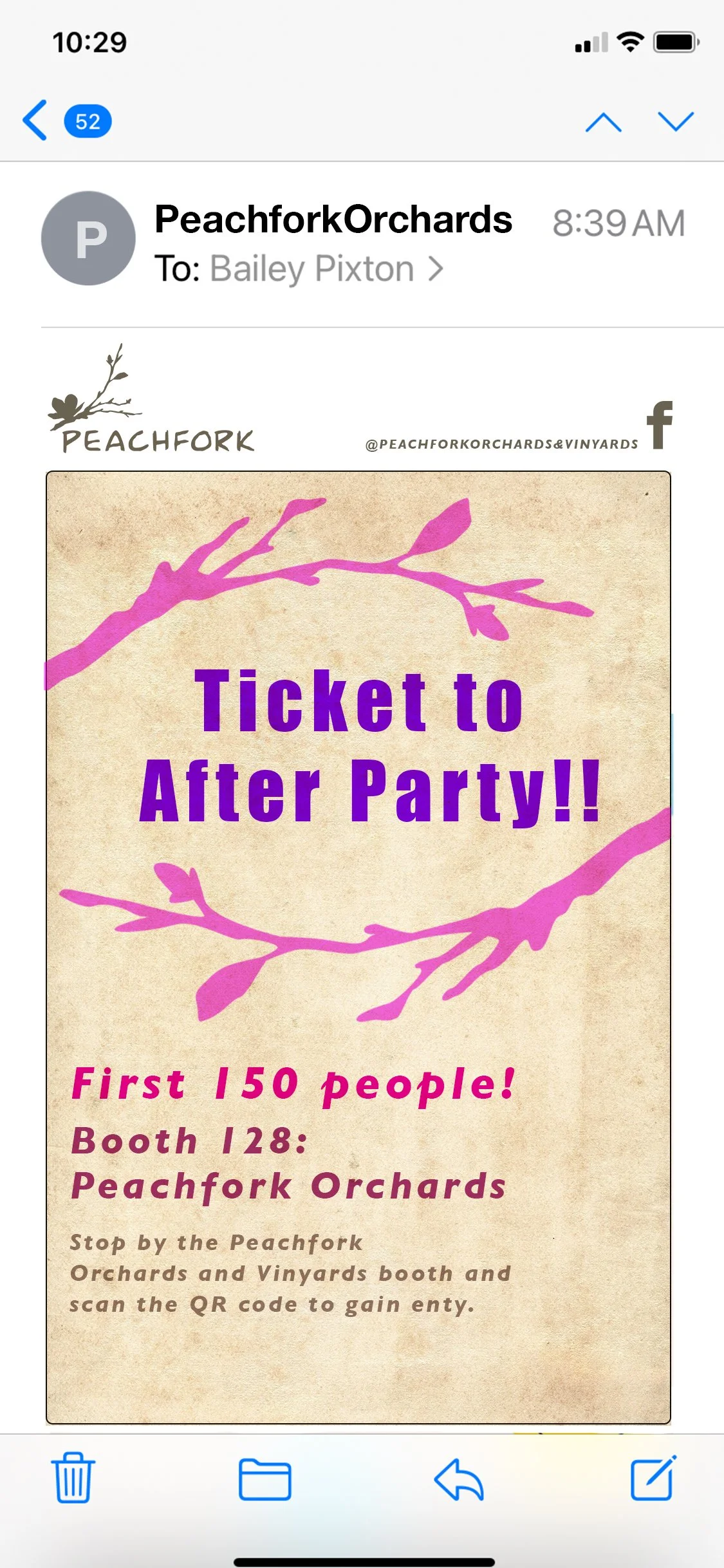
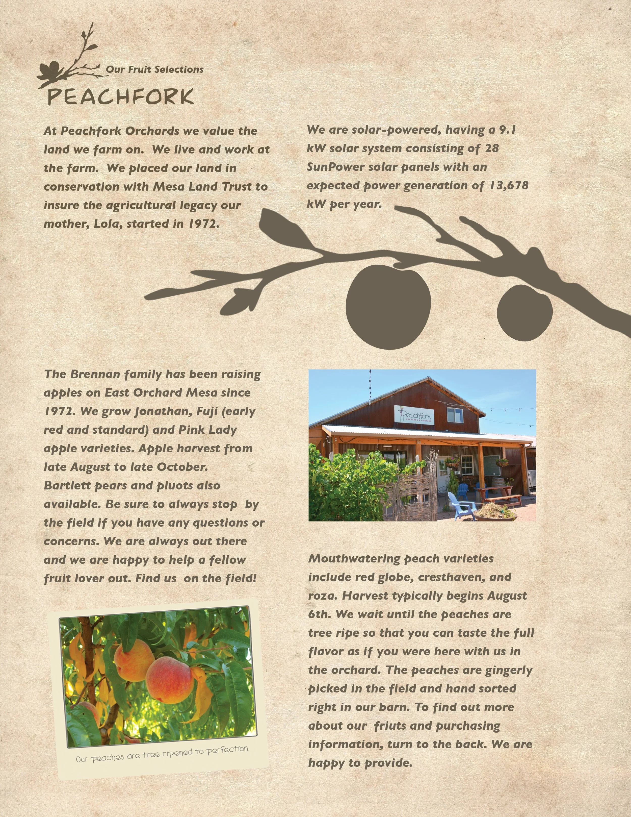
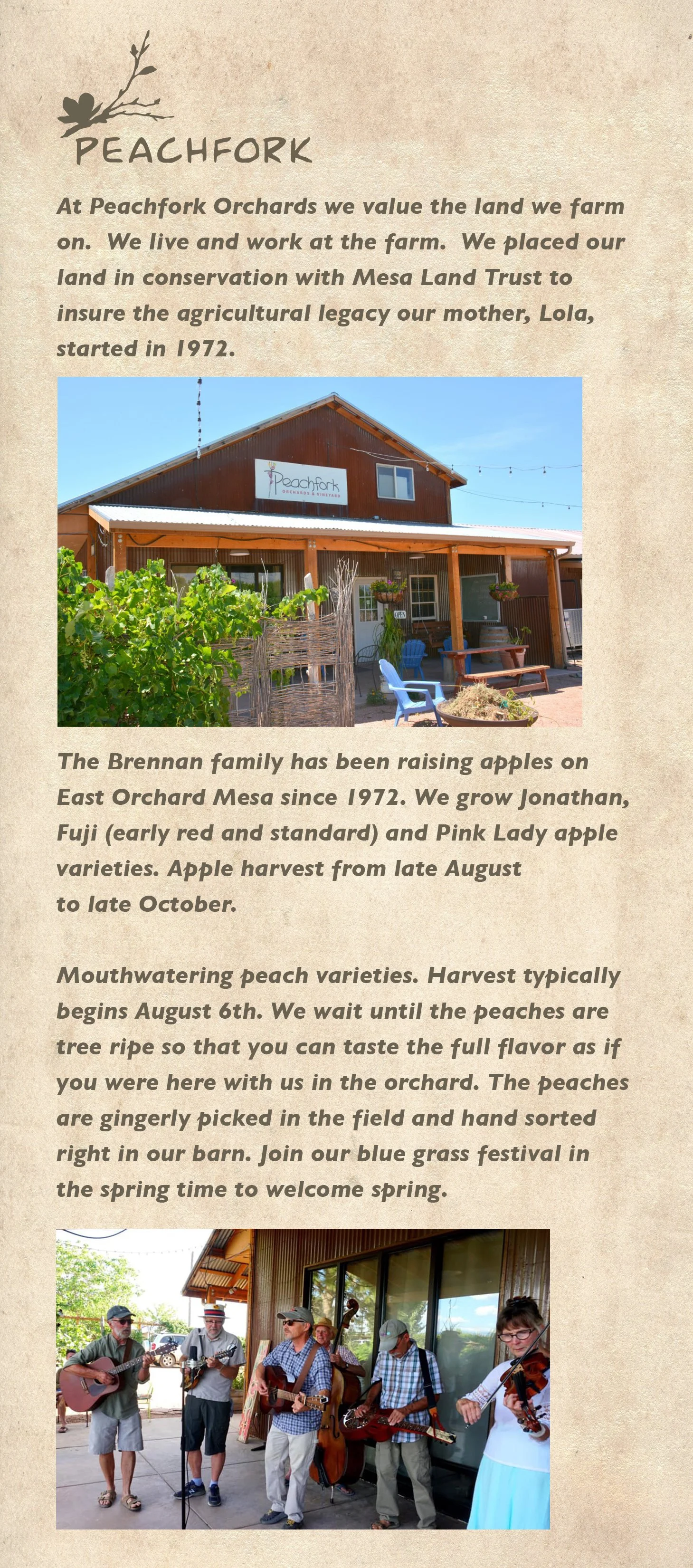
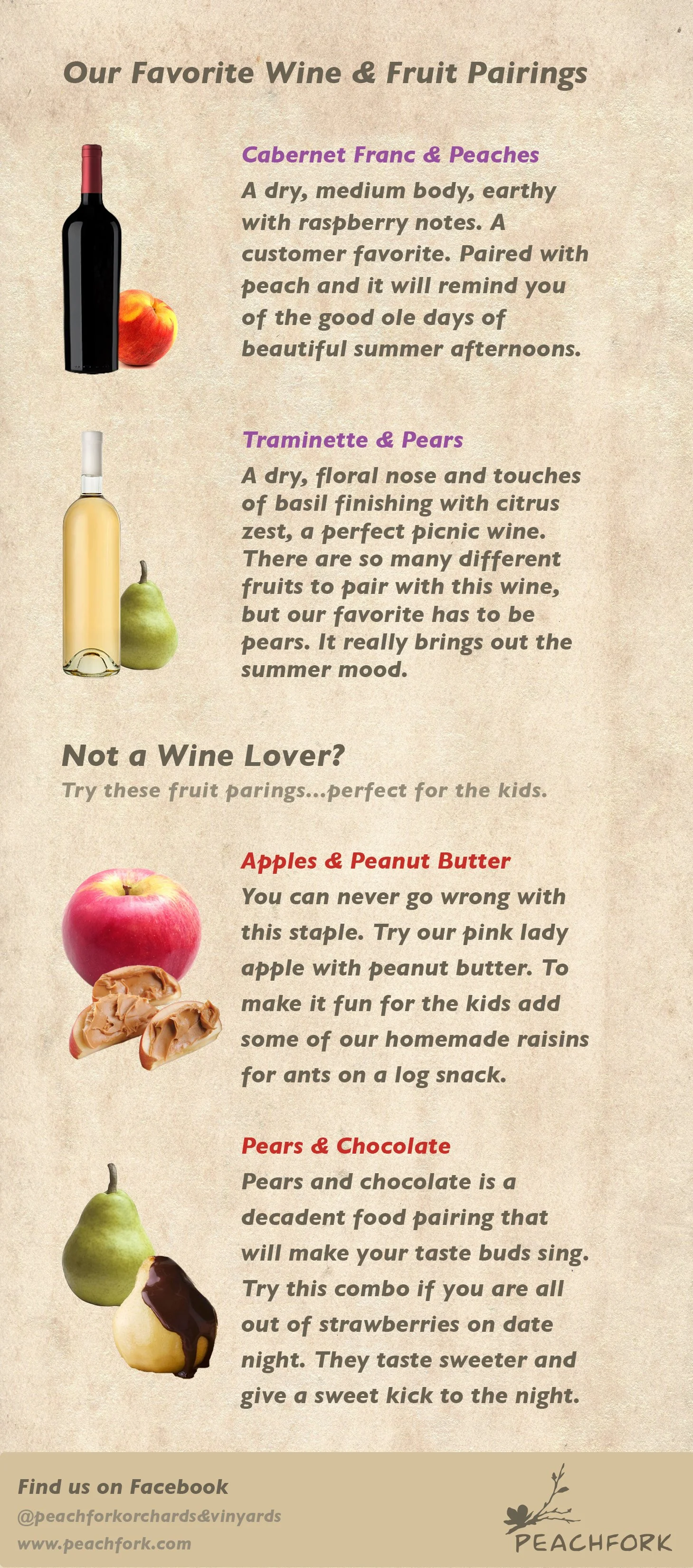
Six different items were created for the trade show which include a newly redesigned business card with their logo, two sales sheet for their produce and wines, a takeaway item to be used after the tradeshow, an eblast, and a freebee to be used at the event itself.
The business card prominently displays the newly designed logo and on the back uses designed tree branches from peach trees to play with the typography information. For the freebee a wetnap was created since so many people will be eating and enjoying the trade show they do not have time to go to the restroom to wash their hands. The eblast uses fun and bold colors to get the viewer’s attention and guide them to the booth and after party. The sales sheets highlight both the produce and wines that Peachforks sells. Providing a helpful log of case and unit specifications and barcodes to check out. Lastly, the takeaway highlights the fun and vibrant culture that Peachfork provides when visiting the orchard. On the back you can find a fun pairing guide to find the best flavors that complement both their produce and wines.


